

Chart of the Week - World Oil Demand
Chart of the Week - World Oil Demand
Rumors of Oil's death have been greatly exaggerated...

Chart of the Week - World Oil Demand Breakout
Fundamental Breakout: I’m a big fan of using technical breakouts as a prompt to take a closer look at a certain asset or market (to then go and build out the rest of the picture) —but a less common approach is to look at breakouts in fundamental indicators.
And this one is worth looking at.
The chart shows world oil demand (across all products, think: gasoline, diesel, jet fuel, LPG, etc), what should be no surprise is the collapse in 2020 (as humanity collectively hit the pause button on travel), and also should be no surprise is the subsequent stop-start reopening rebound.
But perhaps surprising is that we’re now set to return to pre-covid levels with a breakout to new all time highs in world oil demand (and for those who’re curious, it also marks a return to long-term trend — I avoided putting that line in as well as it made the chart too messy… sometimes you have to try and keep it simple!).
I think this chart is worth highlighting for a couple of reasons. Firstly, it may be somewhat counterintuitive in the age of energy transition, ESG investing, and decarbonization — despite all the noise and best efforts of investors and activists, fossil fuels remain important.
But perhaps more interesting back in the blunt pragmatism of macro and markets, this fundamental breakout is likely going to underpin and reinforce an eventual price breakout. I think this is particularly relevant given the significant underinvestment in traditional energy supply.
While renewables are likely the way of the future (and I talked about the substantial valuation reset in renewable energy stocks to now slightly cheap in the latest report), fossil fuels are an important part of the energy transition.
You can’t transition to new energy if you can’t move around, grow and invest, or build anything of significance — and significant building needs to happen in terms of infrastructure, manufacturing, and generation development.
But one impact of the anti-fossil fuel movement is that it has starved the sector of capital. Who wants to drill new wells when none of the big investors want to touch traditional energy? (not to mention the social + political stigma)
So with oil demand set to continue to grow in the coming years, and supply investment remaining constrained, ECON 101 tells us: oil price go up.
Good for energy stocks, bad for inflation, bad for bonds, bad for consumer.
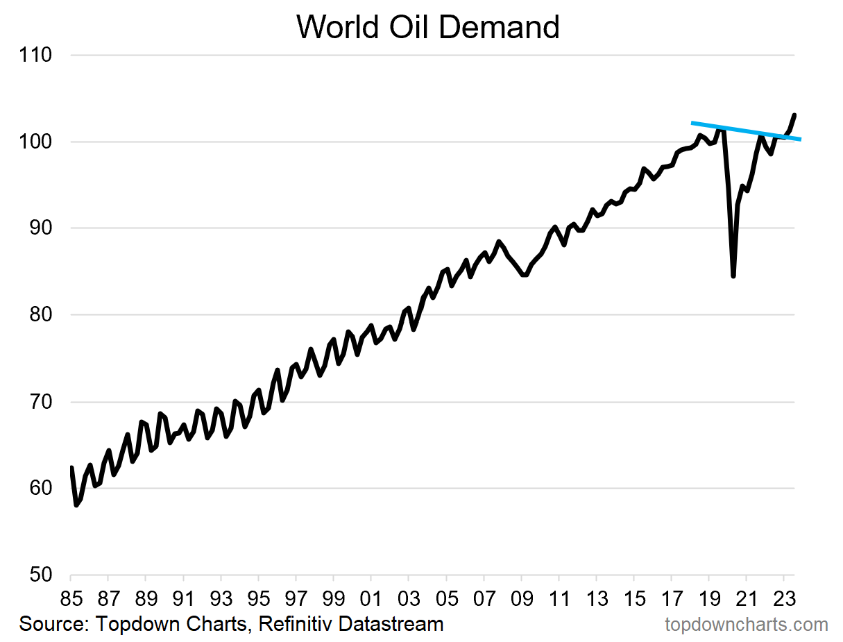
Key point: World oil demand is breaking out to new all-time highs.
n.b. Check out the full archives of the Chart Of The Week for more charts.
Aside from the Chart Of The Week, this email gives you a brief overview of what was covered in our latest Weekly Insights Report (this email provides a free preview of the Topdown Charts premium service on Substack).
Topics covered in the latest Weekly Insights Report
Aside from the chart above, we looked at a bunch of other charts across some important and interesting macro/asset allocation issues:
Market Update: Chinese equities remain skeptical on stimulus
Global vs US Equities: tracking technicals, strategic + macro drivers
Global Tax Trends: what fiscal sustainability questions will trigger
EMFX: weighing up the short-term vs medium/longer-term outlook
EM Sovereign: why EM bonds look better than you might expect
Oil Price & Energy Stocks: oil outlook and energy sector indicators
Renewable Energy Sector: reviewing valuations, technicals, sentiment
Subscribe now to get instant access to the report so you can check out the details around these themes, as well as gaining access to the full archive of reports.
For more details on the service check out this recent post which highlights:
a. What you Get with the service;
b. the Performance of the service (results of ideas and TAA); and
c. What our Clients say about it.
Thanks for your interest. Feedback and thoughts welcome.
Sincerely,
Callum Thomas
Head of Research and Founder at Topdown Charts
Follow me on Twitter
Connect on LinkedIn