

Chart of the Week - Global Yield Curve Signal
Chart of the Week - Global Yield Curve Signal
A unique indicator for global equities with an interesting signal..

Chart of the Week - Global Yield Curve Breadth
Cycles & Signals: Here's an old chart I dug out of a dusty spreadsheet I hadn't touched in a while, and things have gotten interesting…
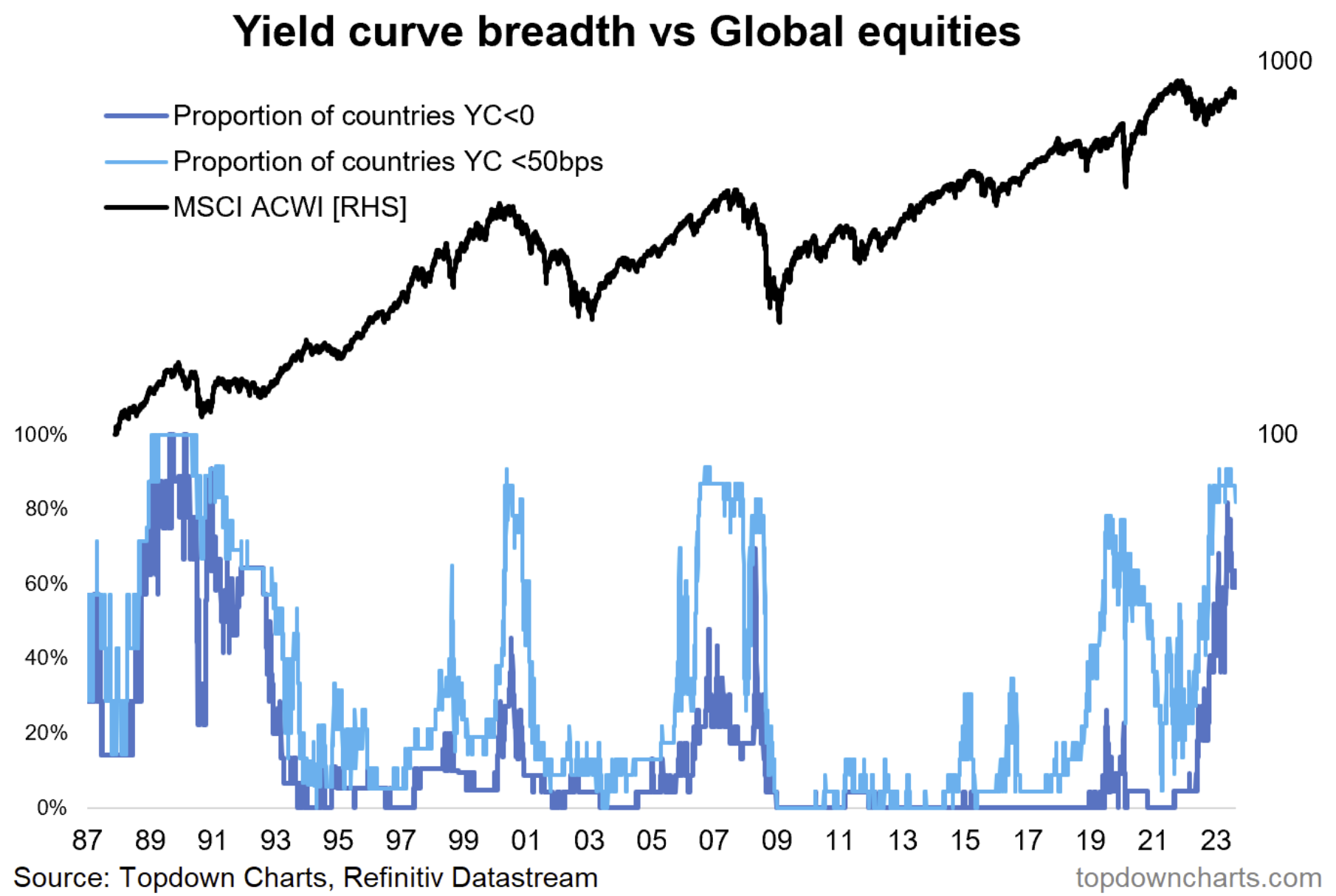
The chart shows the breadth of yield curves (10yr vs 2yr govt yields), with filters set to focus on flattening/inversion, across developed market government bonds... call it the global yield curve invert-o-meter if you would!
It's interesting conceptually as it is well known that yield curve inversion often precedes recession (and market downturns). And looking at the indicators vs global equities we can see that surges in the indicator were seen during some major market peaks. And hence why it is of interest now: we have seen a surge in yield curve inversions globally.
However, astute observers will point out: it's not necessarily the flattening that gets you, but rather the steepening after the flattening.
This is generally because the bearish signal (yield curve steepening) tends to get generated from short-term rates falling fast as central bankers try to avoid recession, and hence why the yield curve is pretty much more of a coincident indicator than a leading indicator as such....
The yield curve inversion is useful as a predictor of recession, but only to the extent that it is a cycle-age gauge.
So basically all of this is telling us that the cycle is long in the tooth, and hence the risk of the cycle running its course and all that comes with that (recession, weaker earnings, bear market risk) is higher than usual.
Key point: Global yield curve inversions sound caution on global equities.
n.b. Check out the full archives of the Chart Of The Week for more charts.
Aside from the Chart Of The Week, this email gives you a brief overview of what was covered in our latest Weekly Insights Report (this email provides a free preview of the Topdown Charts premium service on Substack).
Topics covered in the latest Weekly Insights Report
Aside from the chart above, we looked at a bunch of other charts across some important and interesting macro/asset allocation issues:
Market Update: yields up, dollar up, oil up, stocks down
Treasuries: checking in on a range of charts and indicators
Credit: outlook for credit spreads
Corporate Bonds vs Equities: relative value indicators
Emerging Markets: pairing technicals with valuations and macro
Frontier Markets: surveying risk vs reward on the frontier
Subscribe now to get instant access to the report so you can check out the details around these themes, as well as gaining access to the full archive of reports.
For more details on the service check out this recent post which highlights:
a. What you Get with the service;
b. the Performance of the service (results of ideas and TAA); and
c. What our Clients say about it.
Thanks for your interest. Feedback and thoughts welcome.
Sincerely,
Callum Thomas
Head of Research and Founder at Topdown Charts
Follow me on Twitter
Connect on LinkedIn