

Chart Of The Week - Business Cycle Map
Chart Of The Week - Business Cycle Map
This week: global economic pulse, inflation outlook, treasuries, credit, stocks vs bonds, US dollar short-term vs long-term situation...

This email gives you a brief overview of what was covered in the latest Weekly Insights report including of course, the Chart Of The Week.
Check out the full archives of the Chart Of The Week for more charts.
Chart of the Week - Global Cycle Map
Global Cycle Map: The below chart is from our Monthly Asset Allocation Review, but with a new improvement — the addition of the leading indicator series. Overall it should be clear what this chart is showing, but some explanation is due.
The Leading Indicator series combines the signal from 18 different leading indicators, the Soft Data series combines the signal from the PMIs and business + consumer confidence surveys across countries, the Hard Data series tracks actual activity data (e.g. retail sales, jobs growth, exports, manufacturing), and the Inflation series tracks headline and core inflation measures.
The resulting picture is pretty much your textbook business cycle. Leading indicators turn down, confidence follows, actual activity then drops, and inflation follows with a lag. It makes intuitive sense, and it also helps reconcile some of the current macro conversation (e.g. leading indicators point to recession vs hard data such as employment figures still resilient).
While nothing is ever certain in macro, markets, or life in general, the logical conclusion if we follow the data is that the global economy enters into recession this year. The soft data + leading indicators tell us this, and the hard data is steadily closing the gap.
The last shoe to drop will be inflation, and then it will be back to the start of the cycle — which is a reminder that this is not an exercise doom-merchanting or permabear pageantry, it is a cold and clear-eyed attempt to gauge the point we are at in the cycle so that we can prepare, adjust, and adapt accordingly.
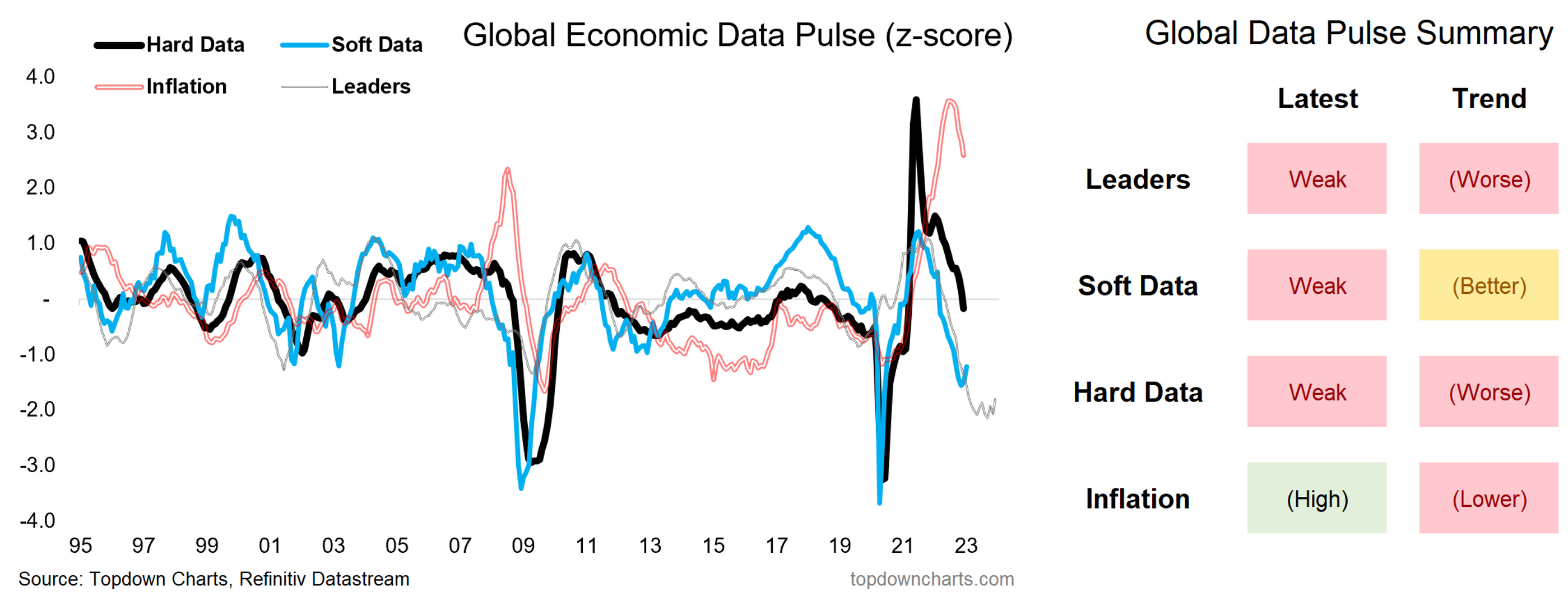
Key point: The data is largely consistent with the 2023 recession thesis.
NEW: Like these charts? Check out our paid service with a 7-day Free Trial
Topics covered in the latest Weekly Insights Report
Aside from the chart above, we looked at several other charts, and took a bite out of some really important macro/asset allocation issues right now:
Global Economic Pulse: mapping out the stage of the business cycle.
Inflation Outlook: mostly downside risk to inflation, with some but’s.
Treasuries: looking at the opportunity in bonds and what needs to go right.
Credit Spreads: increasing evidence points to upside risks for spreads.
Stocks vs Bonds: bonds have the macro + value edge vs stocks.
US Dollar: reconciling the short-term vs medium/longer-term picture.
Market Update: mapping out the risk-on move and its natural limits.
Subscribe now to get instant access to the report so you can check out the details around these themes, as well as gaining access to the full archive of reports.
For more details on the service check out this recent post which highlights:
a. What you Get with the service;
b. the Performance of the service (results of ideas and TAA); and
c. What our Clients say about it.
Thanks for your interest. Feedback and thoughts welcome.
Sincerely,
Callum Thomas
Head of Research and Founder at Topdown Charts
Follow me on Twitter
Connect on LinkedIn